
 All work
Yuko Cream / Branding
Yuko Cream: a language, not a logo.
The thinking / The making
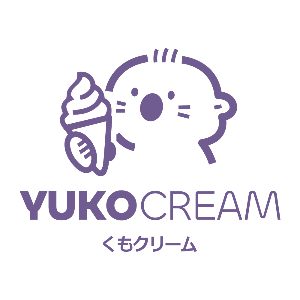
Yuko Cream is a premium dessert brand built on the minimalist elegance of Japanese aesthetics. The name itself signifies friendliness and grace. The brief: make a local shop feel like a franchise in waiting.
We drew the round "Yuko" character enjoying an ice cream cone, set the wordmark in a sturdy modern type, and wrote the whole system (palette, spacing, do’s and don’ts, social grid) into a book the team can run without us.
Every touchpoint now passes the brand’s own three-second rule: you know it’s Yuko before you’ve read a word.
From the brand book / Palette
ROYAL UBE / #715C91CREAMY VANILLA / #ECDBC8MATCHA MIST / #B1DBC0MANGO SORBET / #EEBC6E
The complete guidelines / 14 pages
A language.
Not just a logo.
Keep exploring
OXYGEN WATER TREATMENT

Good people. Great work.